Having previously worked in the paint industry, I am constantly fascinated with creating depth through colour. People generally feel more relaxed entering a room where the walls are painted in a highly pigmented matt finish because the space becomes less defining and the walls appear softer.
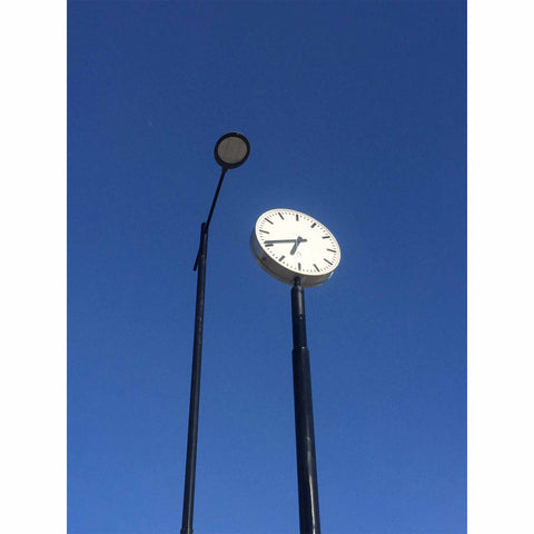
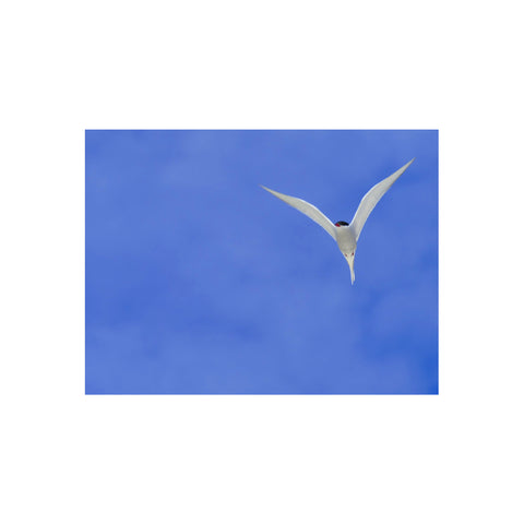
We all know the story which started on a summers day in 1947 when Yves Klein was lying on a beach in Nice looking up at the infinite depth of the clear blue sky when he pledged the sky would be his first masterpiece (by the way, the photo of the blue sky below is taken on Harris, Outer Hebrides of Scotland, not the South of France (!) - arctic terns are my number one favourite bird as I feel they score perfectly on design, function and determination...I digress)
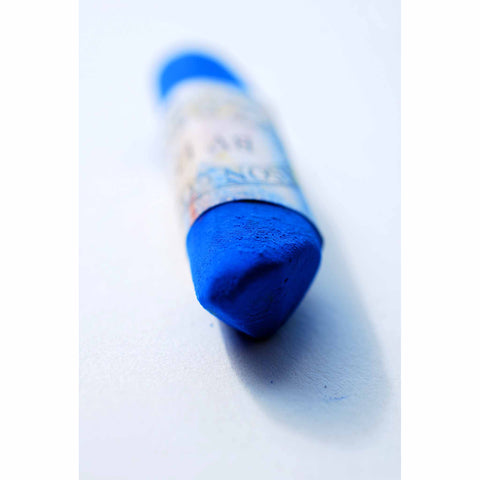
And of course Yves Klein went on to patent his own colour, International Klein Blue (IKB) characteristic for its powerful ultramarine pigment but even more significant for its binding resin which keeps the pigment suspended in a form closest to its original appearance i.e super matt. I don't know about you but I could relax my eyes into IKB for hours allowing myself to be sucked into the space-like void towards infinity.
So when I was travelling in Japan in November I was delighted to stumble across Portrait Relief PR2, 1962 by Yves Klein. The piece was in an indoor gallery located in the incredible grounds of Hakone Open Air Museum
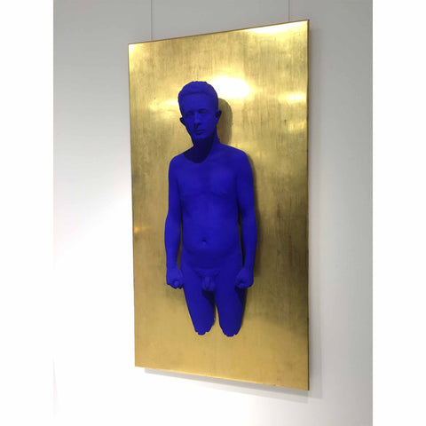
The body is a plaster cast (from life) of one of Klein's friends, poet Claude Pascal. It has been covered in IKB and attached to a bronze backdrop covered in gold leaf (accentuating the blue still further). The "IKB gives the figure a metaphysical quality of both absence and presence, as if levitating from the earthly world", says The Scottsdale Museum of Contemporary Art, Human Conditions catalogue.
He created three such portraits and had planned to make a fourth, a cast of himself, but unlike the previous three portraits, this time the colours would be reversed and his cast was to be covered in gold leaf protruding from an IKB backdrop - I guess a nod to the iconic photograph Leap into the Void , but sadly his early death in 1962 prevented this piece from ever being created - I sometimes wonder if a hologram version could be created using existing photos of Klein...
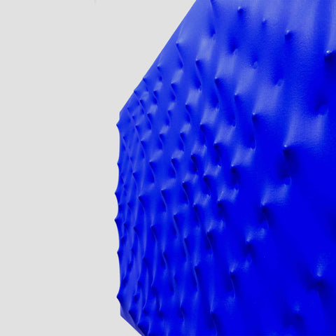
Another artist who creates dreamy depth is Enrico Castellani. I first came across his work in Museo Revoltella Trieste, Italy. He is associated with Zero, a group of artists who created zones of silence using light and motion (Yves Klein was also part of this group).
I had the pleasure of being able to see Castellani's Superficie Blu 2003, in the Mazzoleni Gallery, London last year and again it's a piece you could stand in front of and feel yourself dissolve into it.
Both these works of course are blue, a colour with one of the shortest wavelengths hence its ability to feel distant rather than aggressive and close like the colour red which has one of the longest wavelengths and therefore seems to reach out and demand our attention up close rather than suck us into a distant blue void.
I particularly enjoy working with blue, and use red sparingly. Sometimes I use blue as a detail like the blue squares in the Eclipse print which almost appear to punch holes through the charcoal background.
I am currently working on a new project attempting to creating a sense of space, a project inspired by horizons, Japan and Scotland - I will tell you more about that soon. Meanwhile I hope you are having a blue sky day wherever you are.
Thank you for reading,
Niki